Branding
Atlantas Chess Academy
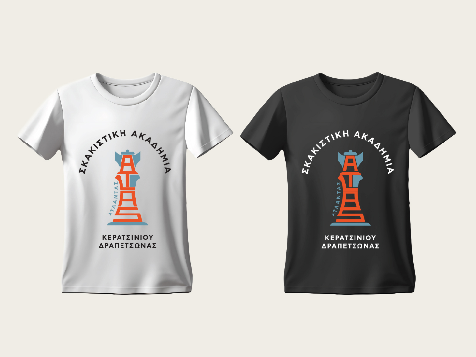
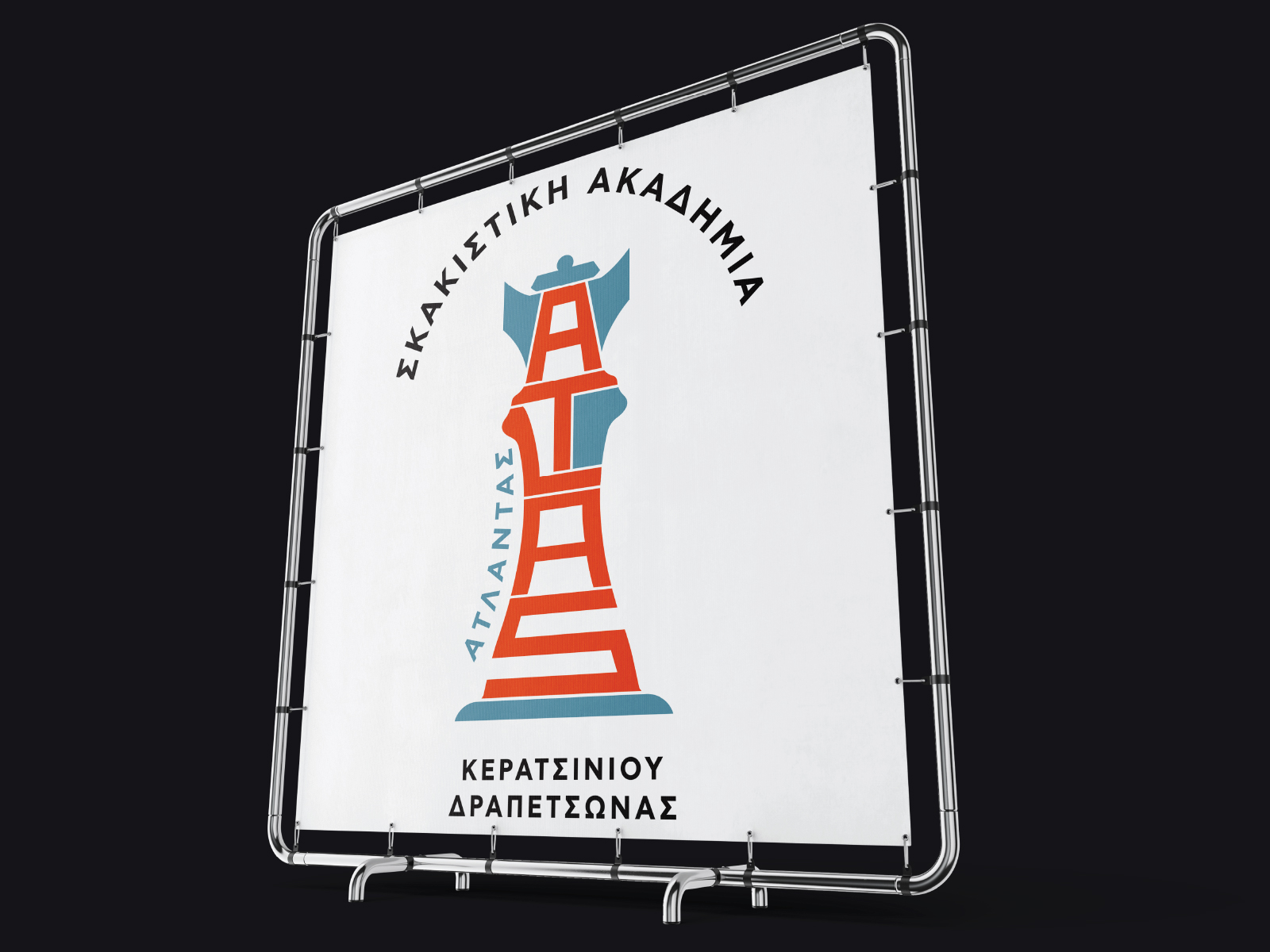
Logo system, applied across banners, apparel & event materials.

Brief
Atlantas Chess Academy, a growing chess school in Keratsini-Drapetsona, needed a mark that felt credible to parents and instantly recognisable to the kids learning to play — something that could carry the club’s identity from a certificate to a tournament banner without losing character.
Approach
The mark takes the shape of a chess king, with “ΑΤΛΑΝΤΑΣ” set vertically inside its silhouette — the academy’s name built directly into the piece itself, rather than sitting beside it. The system was designed in three versions from the start: full colour, solid black, and reversed white-on-black, so the club always has the right file on hand whether it’s going on a certificate, a dark t-shirt, or event signage.
Result
The identity now travels across the academy’s full range of materials — banners, t-shirts, tournament posters and match signage — carrying the same mark and colour system everywhere it appears, at tournaments and in the club’s day-to-day materials alike.
Gallery